Overflow menu
No accessibility annotations are needed for overflow menus, but keep these considerations in mind if you are modifying Carbon or creating a custom component.
What Carbon provides
Carbon bakes keyboard operation into its components, improving the experience of blind users and others who operate via keyboard. Carbon also incorporates other accessibility considerations, some of which are described below.
Keyboard interaction
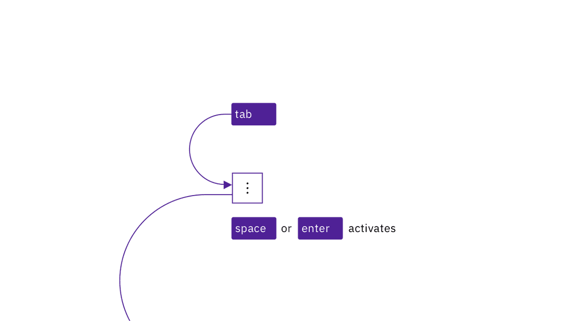
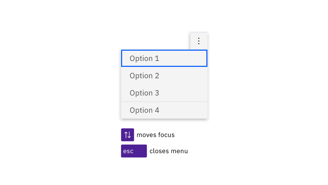
Each overflow menu is in the tab order and is activated by Space or Enter. When the menu is open, the first item takes focus. Focus is moved between menu items with the Up and Down arrow keys. Space or Enter activates the item with focus (which causes focus to go somewhere else and the menu to close). Esc collapses the menu and puts focus onto the menu button.

Overflow menus are reached by Tab. Space and Enter keys open the menu as well as activating menu items with focus.

When opened, the first item in the menu takes focus. Arrow keys move focus, Esc closes the menu.
Development considerations
Keep these considerations in mind if you are modifying Carbon or creating a custom component.
- Overflow menus are buttons with
aria-haspopupset to “true”. - The overflow menu is named with
aria-label. - Each menu item is an
liin aul. - Each list item contains a button with
role="menuitem"andtabindex="-1". See the ARIA authoring practices on menubutton for more considerations.